
The story of the birth of “IRO-POCHI”

In the spring of 2014, we received a request from professor Sagawa to develop a tactile colour tag. After a lot of trial and error based on the colour concept researched by Prof. Sagawa, the current form ‘IRO-POCHI’ was born about four months later, in August 2014. Why did Prof. Sagawa decide to make tactile colour tags? Why this shape? What was the purpose of the development, how did it come about and what were the thoughts behind it? We interviewed the developer, Prof. Sagawa.
Do you know people born blind know colours?
In the course of my ongoing research on colour, I discovered that people who are blind from birth also have a good grasp of colours. For example, “yellow is the colour of a chick, it is bright and pretty”, “red is a passionate colour, green and red at traffic lights are opposites”, etc. Many visually impaired people were found to understand not only the characteristics of each colour, but also the relationship between them. And that they want to choose the colour of their clothes and enjoy fashion by themselves, without having to rely on someone else. I wanted to somehow give shape to these needs of theirs, which is why I started tactile tag project.
Invented a recognition method using hue rings that allows for a sensory grasp of colours
Preliminary research conducted with blind people showed that the colour names and concepts they grasped could be represented graphically in a ring shape similar to a hue ring. This led me to use the basic colour concept of hue rings as a way of describing colour recognition. The hue circle also has the advantage of making it easier to grasp the similarities and differences between colours by the senses, compared to the method of expressing the names of colours in Braille. In fact, in an experiment in which ten basic colours were arranged as small convex dots on a circle and recognised by touch, approximately 90% of people succeeded in recognising them.
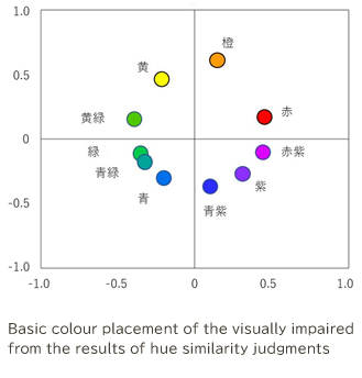
Systematising visually impaired people’s conceptions of colour, it was found that they grasp it in an almost circular relationship, as shown in the figure.
If made into tags, they can be used for a wide range of products.
Having decided to adopt a design using hue rings, the next question was how to give it shape. This is where we came across Fuqui, through an introduction by an apparel organisation that was an old acquaintance. What kind of material is most suitable for recognising dots by touch? How big should dots be? Based on the advice of a manufacturer specialising in apparel subsidiary materials, we carried out various verifications and prototypes, and completed the current “IRO-POCHI” design. A new design for recognising colours by means of small raised dots and holes arranged in a ring on a satin fabric measuring approximately 3 x 5 cm square, this tag can be attached without discomfort to a wide range of products, including scarves and hats, as well as T-shirts and skirts.

Various samples were created, with the shape of the tag, the material and the thickness of the protrusions being worked out. The current design, which is optimal in terms of both appearance and tactile clarity, was born.
Hope “IRO-POCHI” will be spread widely in their daily lives.
I want “IRO-POCHI” to transcend national and regional boundaries and eventually become a global standard. All people enjoy the colours using a common identification method. I believe that such natural things will lead to a prosperous society. There is still a long way to go before “IRO-POCHI” becomes widespread, but we believe that society and people will be better off through “IRO-POCHI”.

■Profile
Prof.KEN SAGAWA
Emeritus Researcher, National Institute of Advanced Industrial Science and Technology (AIST)